Showing posts with label art. Show all posts

Saturday, May 19, 2007

Cats and Koi

My latest watercolor - this is one that I mentioned painting over. It started as an abstract, then ended up turned 90 degrees and about fish, then it ended up with ink on it turned in yet another direction, then the ink went to cats, then the koi appeared (attracted by the cats?), then I added the goldfish and other little items...

See this and others on my webpage, second gallery page. The original is hanging at the Hillsborough Gallery of Arts.

Tuesday, May 8, 2007

Painting over Paintings

OK - part of my artistic slump in recent weeks was that I was stuck in a few paintings that I really didn't want to paint. There is a place for discipline, and a place for "painting what you want" (see my profile on my website for a more colorful rendition of this idea by one of the more influential art teachers along my journey - Marvin Saltzman).

So I painted over that church painting - it worked small, but it was a yawn blown up larger (something else I learned to see thanks to Marvin Saltzman). Even though it started large, it never seemed to have enough going on.

And I painted over an abstract, that had started to become fish (but not very good fish). It was a watercolor, but now it's getting india ink on it (black - haven't used black in several years). Then it got a row of cats on the bottom, and then, lo, more fish appeared. Koi this time. Then I added more. Then I added much smaller goldfish (I love them and their bright colors) then some moors (with their goggle eyes), then things started getting out of hand in a nice way, with jokes and echos of cat and fish showing up on the wrong sides of the species aisle... Congress of Cats and Koi - I think that's what this one will end up. I'll post it when it's done.

Saturday, April 28, 2007

CD Cover - Grizzlies in Central Park

One of my watercolors that did not work out had at least one fun thing going on - the combination of the grizzly's ears and the headlights of a parked car. This painting was to be called "Grizzlies in Central Park," and it featured two grizzlies, some of the Park Ave copper-oxide green roofed buildings, trees, and, prominently, the famous Central Park street lamps.

When I burned a CD of some favs from my PC (so we could play them on the trip to VA) I cut this CD cover from the watercolor. Fringe benefit of having some failed pieces lying around. S CD1. The Central Park lamp posts also made a good cropping - but that's another CD.

Tuesday, April 10, 2007

Next Canvas

It's another Church of the Great Outdoors image - just charcoal on the canvas at this point. I'm experimenting with color combinations on a mouse-overdrawn black and white version of this. It's a bitmap cartoon, of sorts. I'm enjoying completely changing large color relationships with the paint can tool in Paintbrush. I may post some of those color cartoons in a later entry.

Water's Edge - Acrylic

Here is the final version of this painting, now hanging in the gallery. It will be on my website soon, as well.

Sunday, March 25, 2007

Canvas 1

This is my first canvas in many years. I'm wrestling with the lower half. Parts are too simple for a 30x30 canvas - there are sections that look unfinished (lower right). But I don't have anything else I intend to do with those sections. So I'm a bit stuck for now. Partly I haven't worked in this scale for a long time, and I never got comfortable there. Partly it's still about the acrylics, which handle so differently than the watercolors I've learned to love.

So what do you think? Seriously, I'd like to know how this strikes you.

Trouble is that this image works OK at this scale - but not so well at 30x30. So try to picture it two and a half feet square {grin}. Don't you do that sort of thing - wondering what things would be like if they were larger or smaller than they are now? I do this with parts of houses and architecture all the time. Some buildings could be greatly improved in this way - others are hopeless. Some are magnificent the way they are, and I love to feel that by trying to mantally change things and nothing can be changed without departing from perfection.

How about looking at people and trying to picture in detail how they probably looked when they were a lot younger - or how they will look when they are much older?

How about how things would look if a certain item or object were removed? This last one is easier than the others - you close one eye, and cover the item with your hand or fingers or arm so you mind can fill in the scene behind the interrupting limb.

Or how about imagining how something would look in a different color? I do this with cars a lot, picturing them white, in particular, because in that color the shapes become the primary visual element, and I can evaluate the desinger's work. Like buildings, some cars are lovely and perfect balances - others are terrible ugly combinations of forms and proportions that look worse than random. And the rest are in between, where mor games can be played with changing shapes, lowering bumpers, decreasing the size or position of tail-lights, etc.

Doesn't everyone do this stuff? How do you not do this?

Thursday, March 22, 2007

Storm

This was the third or fourth watercolor I did when I started painting again. I was letting places emerge from scribbles on the paper, something I still love to do. It's like a child's drawing in some ways. I want to do more like this. The clouds were great fun; I had no idea what I was doing. Now I would have some idea how to paint storm clouds and I'd have to deliberately forget so I could play like this again.

I think that's what it's about sometimes. When you're a kid you try so hard to grow up and be like an adult. Then you get there and find out you still don't have real control or real answers to most things, and you might have been better off if you hadn't grown up so thoroughly. Can't be helped - gotta backtrack some. Maybe I should try painting with my left hand, or with my eyes closed.

Friday, March 9, 2007

Moleskine in Williamsburg

I only did two other sketches while in Willamsburg. This was intense family time, and I only had two moments really alone. One was in the hotel room late, when everyone else was in bed but my oldest son and I. I never looked this closely before at the pattern on his sweater, or the folds of his jacket.

The other moment alone was when the rest of the family went to participate in some homeschooling craft and educational stations set up in a house near the Capitol shuttle stop. I'm claustrophobic and impatient in that type of setting, so we agreed to meet a half an hour later.

I was struck again by the beauty of the Capitol building, and, since I'm discovering that you really know a thing better after you draw it, I sat out in the less than 40 degree weather, on a bench by the shuttle stop, and drew this scene. That's how I actually noticed that the capitol is not symmetrical - the connecting section, which tied the court room to the legislative side, is not centered, and so neither is the cupola on top when viewed from this side.

Next posts will be more Virginia and a Texas trip (business) that I took the very next day (just got back this evening). Lots to write about, and lots of pictures.

Tuesday, February 27, 2007

Moleskine One

I bought a moleskine a while ago, based on all the buzz. Famous authors, artists, bloggers, daily sketchers, I lived over 40 years without ever hearing about these magical little books, but now they're everywhere.

So in Ashland, KY (see January posts) in the early morning, with snow falling outside my hotel room window, I was struck by the arrangement of my keys, comb, and pen on the desk. I wish I hadn't cartooned the left portion of the comb, but I'm pleased with this sketch. I have not been one who doodled or sketched all the time, but this could be habit forming.

A few weeks later the cats and sun posed. Actually the male (Tamlin, on the right) moved midway through drawing him, so his pose combines several moments. And he left completely before I could finish. I really like to draw them, and I'm mesmerized by their movements, particularly Tamlin's - the muscles and bones moving beneath his ginger striped fur. So alive and languid, like an athlete after a massage and a hot soak.

Tuesday, February 20, 2007

Brinegar Cabin

This is the first acrylic painting I've finished in many years (it sold after only two days in our repainted gallery in Hillsborough - a nice feeling). I took the photo for this before any of my kids were born - so it's been a LONG time coming. I deliverately took it to paint the scene. Brinegar Cabin is in Doughton Park, on the Blue Ridge Parkway, maybe an hour's leisurely drive SW of Fancy Gap (up route 52 from Winston-Salem). This piece is about the fences, and the beautiful way everything is set in the landscape. I also love the winter hues of this shot, and I tried to capture that in the paint. The tan/gold of broom sedge, the pale silver/brown of chestnut rails. I edited out a tree that grows in front of the cabin, which would have split the piece in half, interupted the cabin's roofline, and distracted from the play of lazy diagonals. Easiest piece of logging I ever did.

This is just a 16x20 clayboard (basically masonite with a baked white surface - smooth or gritty, your choice), but to me the big deal was returning to these confusing pigments. I have a larger canvas started, as well - 30 x 30 - and I find I have to be in just the right mood to get out the paint and get going. With time and experience I hope that changes. I have a lot of loosening up to do - this was more of an exercise, proving to myself that I can handle this kind of paint.

For me acrylics are harder than watercolors right now for three reasons.
1. When you start you get out a lot of paint and you're committed. When acrylic paint is dry on your pallette, it's dead. With watercolor I can paint a bit now, splash some water on the pigments to take a break, come back hours later or even the next day, and water makes the pigments ready to go again. Some become grainy with repeated rewetting, and must be replaced, but most good watercolors behave beautifully. Since my life has so many other responsibilities and pleasures, it's hard to block out an uninterrpted couple of hours to make acrylics worth doing. Twenty minutes of watercolors is possible many evenings.
2. When you lay on acrylics, they are opaque. So to use the underlying color requires particular brushwork or conscious decision to leave an area uncovered. When I work with watercolors I can layer transparent colors on top of each other repeatedly, until I get the effect I want. So I'm unfamiliar with the level of immediate commitment acrylics require. You can paint over them, and being opaque they are more forgiving than watercolors, but you don't build your final hue or value gradually. You put it on your brush and lay it on. Commitment - that's what I lack.
3. Acrylic hues are chemicals - and they interact in ways that don't follow the simple color wheel we all learned in grade school. It is amazing the browns and olive greens you get when you mix what seem to be pure hues of intense colors. Acrylics force you to learn each pigment's qualities and mixing abilities, and more than anything, to focus on the visual coolness or heat of the color. Cadmium Yellow and Naples Yellow will not make similar greens.

I hope to do a lot more of this, and to get loosened up and let the paint be paint, as well as animals, skies, trees, and all the other things I'm loving to do.

Saturday, February 17, 2007

Abstract 15

Abstract 15 is complete (I just need to sign it). This one went through several phases, most of them boring. It leaned against my work table for a long time, with a blank look on its face - a pale face with no eyebrows or eyelashes. At one point I thought it would never resolve itself into anything interesting enough, and I was preparing to just pull it off the board and start another. That's when I let go and had more fun. Most of the color in the lower half was the result.

While I love the subtle colors and grays at the beach, part of me is hunting for more colors. My sweet tooth. I'm imagining the tropics - yet even photos of the beaches in the south seas seem disappointingly short of the full spectrum. I want more than blue and gold. So this painting didn't surprise me, especially this time of year.

It is sub-titled "The Starfish."

Sunday, February 4, 2007

Opening with Kites

When I first began to be unblocked again about my art, I couldn't deal with a blank page. The idea of doing a painting or a drawing - even a sketch - was too much. Too serious. For that annoying litle voice inside of me, artwork comes with the expectation of a certain level of success or ability, and I was not ready to listen to my own censor on that level.

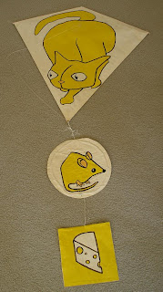
So I started daydreaming about kites. I first thought of a bright orange fantail goldfish. That kite went on to show up in some of my first recent paintings, once I get that far, but I haven't made an actual kite of a goldfish, yet. Then I bought some beautiful bright yellow wrapping paper, and some sticks and string, and I made the first kite in yellow. Before I stretched it on the frame I drew a cat on it, and then painted the background with white acrylic house paint.


For the kite's tail I decided to make a mouse. On one side the mouse is unaware of the cat - but on the flip side of the mouse medalion the mouse will see the cat. When we flew this kite, on a frigid windy day last March, the mouse spun quickly under the cat and it looked like a flip-book movie. Beneath the mouse was a cheese, mentally continuing the storybook foodchain.

I made a bighorn sheep kite, later, but was never as pleased with him. He's on my website's "silly" page, along with these photos of the cat and mouse.

Saturday, January 13, 2007

Abstracts - Why?

"Any kid could do that."

"Wow. Maybe I should get some paint and slap it around like that, too, if you can earn that much money doing it."

"I don't get it."

A lot of people don't understand what they call "abstract" art.* If the art isn't about something they have no way to relate to it. I understand this, and I sympathize.

On some level, though, all good art has form and structure that could exist separately from the subject. The shapes, relationships, colors, rhythms, spaces, silences, sounds, etc. can all work without depicting anything we recognize. Modern art finally broke free of subject and found ways to work more directly with these aesthetic forces.

For those of you who love classical music think of it as being a bit like Beethoven's string quartets. Some of them get pretty weird, if you compare them to the large conventions and forms used in his symphonies and other works for mass audiences. He was experimenting more freely, without constraint, in the quartets - and they sound more modern as a result. I'm not saying his symphonies are "objective" or about anything - but his quartets are somehow purer ventures into the forms of music.

I recall a Christmas shopping trip to Albany, NY when I was about 16. I was able to leave the rest of the family and meet them later. After shopping I ventured out into the huge mall that runs under the four buildings that house NY's state government. The walls held a few dozen enormous non-objective paintings, the first I'd ever seen. I went back and forth for what I recall as nearly a half mile stretch, staring at them. I did not understand them, but I felt like I was trying to read a language that I recognized as my own. They scratched an itch I'd always had and hadn't known could be scratched. They were messages in a bottle and while thousands of fish swam through the same waters with me, I seemed to be the only one stopping to pull the cork and look at the paper inside. How could everyone else just walk past these - I wanted to stand and watch them like an incredible sunset, or some virtuoso performance. It was one of the moments that eventually led me to become a visual artist.

For me the struggle is that without real things I slide towards boring shapes, over simplifying everything so there is no energy on the page. So my non-objective pieces usually ARE abstractions of real things. Eventually I push the painting so far I can't find any trace of the original object, and I work hard to keep any other objects from emerging.

I've started a group of watercolor abstracts, using tape to mask areas and paint in layers. Eventually some areas have four and five layers of masking and painting done, so the surface gets fairly interesting.

Each of these is, for me, like a visit to a place where people don't live. I have to become something else to go there. Something lighter, as if I have to leave my body behind. And words don't work there. That's how I recognize that it's the same silent country where all my artwork grows, but it's higher into the hills. The air is a lot thinner and colder there, but the stars are brighter, and I can almost fly.


* When people use the word "abstract" they usually mean art without recognizable objects or subjects. Abstract correctly means that real objects WERE involved, but they have been simplified to their most general traits (abstracted), so they might (or might not) be recognized any more. Some non-objective art actually starts without anything recognizable, and thus it is not "abstracted" from anything. So not all abstract art is non-objective, and not all non-objective art is abstract. Non-objective describes the piece, abstract is more about the method used to get there.

Seasonal Issues, Light, Color Sweet Tooth

From older blog 12/18/06

What a shock. These last few years I've been helping my lovely wife and my beautiful daughter with their seasonal depression ("Did you use the light box today? Taking your fish pills? Get a walk in the sun this afternoon? Need someone to listen?") and in the middle of Christmas Explosion II Laura grinned and told me I had it too. I was jerked up so short all I could do was the mental equivalent of a fish making "o"s.

So many things made sense in a rush. The frustration I felt when the Daylight Savings bill was going to phase in the expansion of Daylight Savings Time, instead of getting it going NOW. The way I treasure and grasp at every last ray of sunshine in the last hour of the day, like someone sopping up every drop of gravy with bread. The way my inner artist in the winter gets even more of a sweet-tooth, and I can't prevent all this yellow and orange from getting on everything. Neon pencils. Ultramarine blue to make the oranges and yellows go shrieking off the page like a flare, signalling the sinking of my emotional ship as Christmas approaches and with it the shortest days of the year.

Check out Gallery 2 and see "Wake Up!" which is my latest. The camera blue-shifted it - in life the blues are so French and lovely deep, making the tangerine and sunbeam colors sing. Looking at it I can smell citrus.

So Christmas Explosion II was shut off as suddenly as the needle skidding off a record. With my jaw dropped open I realized with huge relief that there is an explanation for the self destructive tendencies. Later Laura brought me a glass of water and a fish pill. (I'm not sure who makes them but they are big enough to look like they belong in the other end.) Most of the day we spent outside in the sun, enjoying that warm weather that makes Christmas seem a mirage, but that makes NC winters so lovely. We could almost imagine that spring was only a few weeks away. We grilled (I tried air cured sausages from Billy's in Wallace, NC for the first time - MAN are they good) and sat outside until dusk.

And today, except for the familiar emotional nose-dive at sunset, has been a much better day. Sometimes a demon is easier to handle it you know its name.

House of Frames - 12/05/06

From older blog - 12/5/06

I stopped by House of Frames in Durham, today. I like being there. It's like the best of hanging around with art students, talking shop, looking at work on their walls, seeing the word "Rosehips" written fairly large on a piece of matboard and recognizing it as Ippy Patterson's hand and asking and having that confirmed. That last item made me feel like I'd blind tasted a wine and gotten the grape, region and vintage correct. But Ippy's hand writing fascinates me, so it's easy for me to spot.

John was there and had actually dropped into our gallery, recognized me as someone who showed there, asked my name and what work was mine, and when I mentioned the graphite "Central Florida" that I have down there now did my ego a lot of good by recalling it immediately and having nice things to say about it. I wonder if I wanted to have a few drawings to hang at "House of Frames" if they would consider me?


Anyway, Jim met me there, we settled the question of glass, I decided to do the UV glass to give the best protection to the colors on "Hounds," and it was all worth it for the feedback on my art and the opportunity to talk to Jim while driving him home. Having him along even made the Costco stop an occasion (he even pushed the cart while I tossed large items into it). Traffic was bad getting onto Greensboro Rd and we still got to his house way too soon.